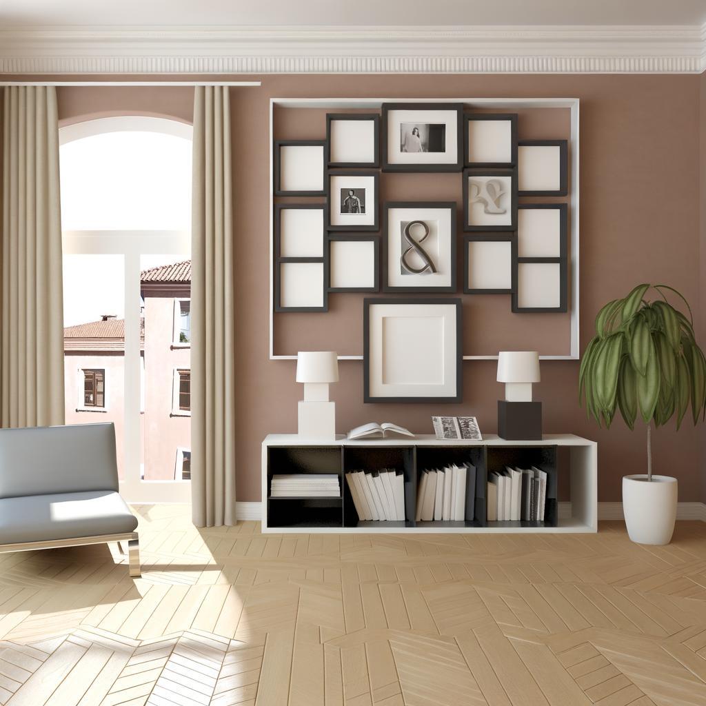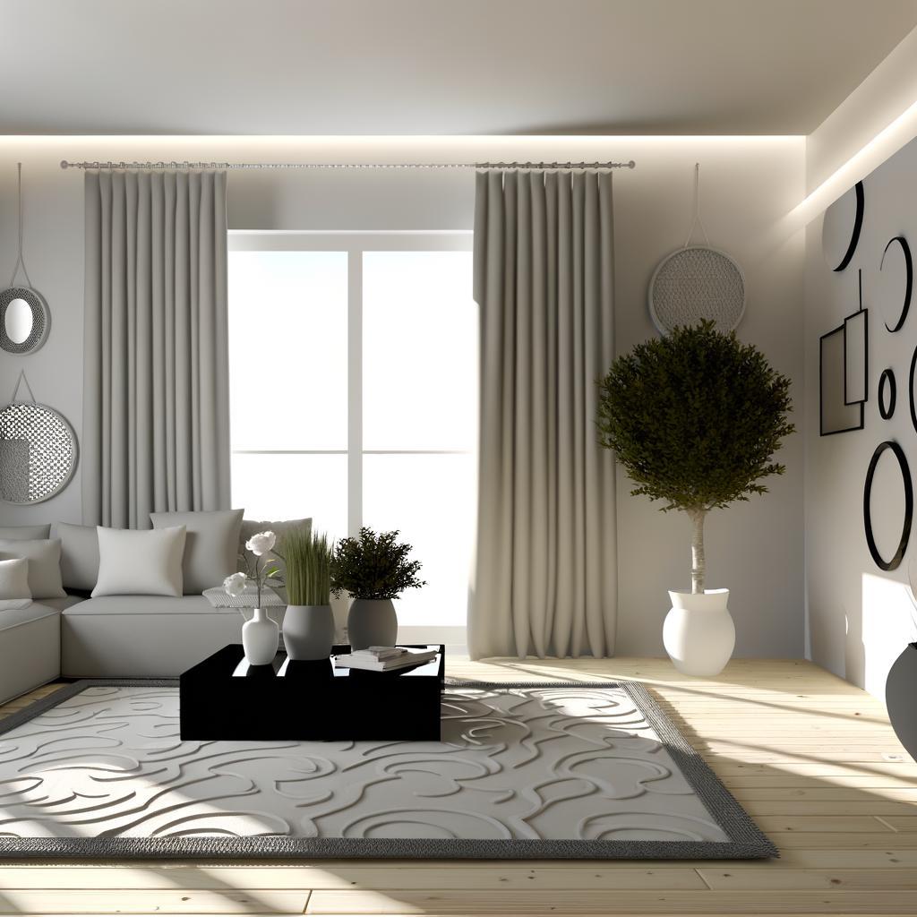

Ever wondered why some rooms instantly calm you, while others feel busy or tiring, even with expensive décor? At Kolkata Canvas, we design homes where every shade has a purpose, using the psychology of color in home interiors to shape mood, energy, and comfort. Imagine a soft mint living room that cuts through Kolkata’s humid afternoons, or a rich terracotta dining space that feels like a cozy Park Street café at dusk. In this blog, we’ll share practical, design-ready ideas to help you use the psychology of color in home interiors with confidence.
Understanding the psychology of color in home interiors for calm and comfort in Kolkata homes
Color shapes mood long before furniture or décor, and in Kolkata’s homes-where monsoon skies, bustling streets, and colonial facades set a rich backdrop-the right palette can be deeply soothing. When you understand how shades influence emotion, The Psychology of Color in Home Interiors becomes less theory and more of a practical tool to create calm, cocoon-like spaces that help you unwind after navigating Park Street traffic or a hectic day in Sector V.
Soft blues and muted greens mimic the serenity of the Hooghly at dusk, ideal for bedrooms and balconies where you crave quiet reflection. Warm neutrals with subtle undertones of beige, greige, or taupe can offset the intensity of Kolkata’s humid summers, offering a cool, grounded base for living rooms that host both adda and afternoon naps. At Kolkata Canvas, we carefully layer these hues with natural textures, controlled lighting, and thoughtful art so every room feels emotionally balanced-elegant, inviting, and unmistakably yours.
| Color Family | Emotional Effect | Best Used In |
|---|---|---|
| Soft Blues | Calm, clarity, mental rest | Bedrooms, study corners |
| Muted Greens | Balance, freshness, renewal | Living rooms, balconies |
| Warm Neutrals | Comfort, softness, stability | Hallways, multi-use family spaces |
| Blush & Peach Tones | Gentle warmth, welcome | Entry foyers, dining areas |
Using color psychology to design vibrant living rooms inspired by Kolkata streetscapes
Step into a living room that echoes the pulse of Kolkata’s streetscapes, and you’ll immediately feel how the psychology of color in home interiors can energise everyday life. Think of the warm terracotta of old North Kolkata facades translated into accent walls, the bold rickshaw-yellow reimagined as statement cushions, or the cool, misty blues of the Hooghly at dawn flowing through rugs and artwork. At Kolkata Canvas, we curate palettes that borrow from hand-painted shopfronts, tramlines, and leafy avenues, then refine them into sophisticated schemes that feel vibrant yet deeply relaxing.
Instead of randomly adding bright tones, we use color psychology to balance this urban vibrancy with comfort and elegance. A living room overlooking a bustling Sarat Bose Road might feature saturated teal or emerald near the windows to ground the view, while softer beiges and muted corals create a calm conversational zone indoors. To help you see how Kolkata’s streets can inspire your palette, here’s a quick guide we often reference while designing:
| Kolkata Streetscape Inspiration | Mood in the Living Room | Suggested Use of Color |
|---|---|---|
| Yellow taxis & tram lines | Cheerful, sociable, energetic | Mustard or marigold cushions, artwork, or piping on sofas |
| Heritage facades in terracotta | Warmth, nostalgia, comfort | Terracotta or burnt sienna accent wall behind the sofa |
| Monsoon sky & river hues | Calm, airy, reflective | Soft blues and greys in rugs, curtains, and upholstery |
By grounding these street-inspired shades in premium textures-linen drapes, velvet cushions, handwoven dhurries-we create living rooms that feel as alive as Park Street at dusk yet as restful as a quiet morning balcony in Ballygunge. Every color choice is deliberate, emotionally tuned, and aligned with how you actually live, ensuring your space doesn’t just look stunning, it feels intuitively right every time you step in.
Balancing warm and cool colors in home interiors for elegant Kolkata bedrooms and balconies
In compact Kolkata bedrooms that open to breezy balconies, the magic lies in how you balance warm and cool shades so the space feels both restful and inviting. At Kolkata Canvas, we often layer warm terracotta, muted marigold, or soft beige on accent walls or upholstered headboards, then calm the palette with cool dusty blues, sage greens, or soft greys in curtains, bedding, and rugs. This thoughtful play of contrasts uses the psychology of color in home interiors to create a cocoon-like comfort that still feels airy in the city’s humid climate.
For balconies that overlook tree-lined lanes or the silhouettes of old Raj-era buildings, we love extending this balance outdoors. Cane or teak furniture in warm wood tones pairs beautifully with cool-toned tiles, patterned outdoor rugs, and leafy greens in ceramic planters dipped in blue, teal, or off-white glazes. A quick guide many Kolkata Canvas clients find helpful:
| Area | Warm Color Ideas | Cool Color Ideas |
|---|---|---|
| Bedroom | Terracotta headboard wall, champagne or sand-hued linens | Dusty blue cushions, pale grey drapes |
| Balcony | Teak chairs, ochre cushions, brass planters | Sea-green tiles, indigo pots, mint side table |
By keeping roughly 60% of the room in soft neutrals, 30% in cool tones, and 10% in warm, statement accents, we ensure your bedroom and balcony feel like a seamless, elegant retreat-perfect for a morning cha by the window or a quiet evening looking over the Kolkata skyline.
Color psychology for functional spaces creating focused kitchens work corners and pooja zones in Kolkata homes
In compact Kolkata homes where every square foot must work hard, color becomes a silent partner in how you cook, concentrate, or pray. In kitchens, thoughtfully applied the psychology of color in home interiors can turn a chaotic rush-hour space into a calm, efficient zone-think soft sage or muted teal cabinets to cool the city’s heat, paired with warm wooden textures that echo old North Kolkata homes yet feel unmistakably modern.
For work corners carved out of bedrooms or balconies, Kolkata Canvas often recommends a backdrop of soft neutrals-misty greys, warm beige, or pale greige-with a single accent band of deep blue or forest green to signal focus and productivity. Pooja zones, whether a carved niche in a living room or a dedicated mandir, glow beautifully in gentle whites, cream, or pale marigold, with subtle gold highlights that reflect diya light and create a serene, spiritual atmosphere even in a high-rise overlooking the Hooghly.
| Functional Space | Ideal Color Mood | Suggested Palette |
|---|---|---|
| Kitchen | Calm, efficient, clutter-free | Soft sage, muted teal, warm white, light oak |
| Work Corner | Focused, low-distraction, modern | Mist grey, beige, deep navy, forest green |
| Pooja Zone | Peaceful, sacred, uplifting | Ivory, cream, pale marigold, soft gold accents |
Insights and Conclusions
As we have seen, the psychology of color in home interiors is far more than theory; it quietly shapes how you wake up to the first light over the Hooghly, how you unwind after a long day on Park Street, and how your family connects over an evening adda in the living room. Thoughtfully chosen hues can cool a sun-drenched south-facing bedroom in Behala, make a compact Salt Lake apartment feel more expansive, or turn a Ballygunge dining room into an intimate, mood-lit space for slow Sunday lunches. When color is planned with intention, every wall, fabric, and finish works together to support your lifestyle, your emotions, and the character of your Kolkata home.
From calming blues that offset the city’s buzz, to earthy terracottas that echo old north Kolkata courtyard homes, the right palette balances modern luxury with familiar cultural warmth. This is where expert guidance matters. At Kolkata Canvas, we don’t just pick “pretty” shades; we design complete, psychologically tuned color stories for each space-factoring in natural light, room function, architectural details, and how you actually live. Every project becomes a tailored composition, whether it’s a minimalist high-rise overlooking EM Bypass or a heritage home that needs a refined, contemporary update without losing its soul.
If you’re ready to move beyond random paint swatches and create interiors that feel as good as they look, allow the psychology of color in home interiors to be your starting point-and Kolkata Canvas to be your design partner. Explore what your space could truly become: you can Get a Quote for a customised design consultation, or quickly Calculate Interior Cost to plan your next step with clarity. Your home in Kolkata deserves a palette that tells your story with elegance, intention, and enduring style.